
Then how to design for people who against digital? I will show you the experience I gained:
Tip 1, make it simple. Yeah, being simple is always the most important thing.
First, you can use simple clicks rather than complex action such as "Input", "Drag", or even "Read" to minimize user frustration. Be just like those P2P lending apps! LOL~
Start with the onboarding process, it's important to lower the churn rate with only collecting necessary information. All the other data, users can fill in afterwards. And we will offer incentives as rewards to encourage them. Then for retailers, they only need to finish 3 steps and fill in 6 items to be verified. For farmers, it's even easier, they only need to finish 2 steps with 2 simple clicks, all the data can be filled in later.

Onboarding flow will only require necessary information and simple clicks
Second, set a stable structure. Such as, you don't need to offer more than 4 main tabs, otherwise it will be too much for our seniors to remember. If possible, 3 is a better number.
Third, organize the service blueprint, you will find out things to improve. For example, after solving the service blueprint, I tried to transfer some manual steps to the "Upper Level Users", because they have more motivation. For example, distributors or the brand itself can support retailers to finish verification since they need to know retailers' information. Retailers can directly add farmers to the app since they need to maintain their own customer group.

The e-commerce platform contains 2 apps, one for farmers to purchase, another one for retailers to manage their stores
Tip 2, make it vivid.
Chinese seniors react better towards a bright color, such as red, warm orange, and bright green. Those colors can quickly grab their attention, you can get a good result if you put them in the commercial graphics. So for color and image side, I chose a warmer tone, high saturation to create a bright atmosphere. This vivid style does deliver a more delightful and attractive feeling. For example, you can check the knowledge app's new version below. It has a quite good performance rate, the user's page stay time was basically doubled.
Here is the comparison of the old and the new knowledge platform app, you can see the difference
For building the visual language, I also did a selection of all existing photos and adjusted them to a warmer tone, so the overall impression is consistent.

Since it's a product for China, so I selected Chinese faces only to avoid farmers feel distant
Tip 3, be concrete.
One abstract image maybe artistic, but it will be hard for seniors to understand. Use no geometric graphic or illustrations but photos instead. Well, if your company has no enough budget for photo shooting, then build an illustration library based on the real human proportion rather than a Q version. I already ran tests for you, farmers prefer "Real" than "Cute".

We mainly use "Photo + Color" style, but also we build an illustration style to face the lack of photo shooting budget

The illustration library contains main user groups and crops
Tip 4, better readability.
Most of our users are seniors, the font size should be bigger. Consider their vision, the mini font size should be 18dp/pt. Use less background colors, dividers, or borders, use white space instead. Those "dividers" will only bring distraction.
Content wise, videos instead of long articles. Our users are not patient, they prefer short videos. So I collaborated with our market team, together we created lots of videos for user guidance, farming knowledge...
Adding pictures for explanation is also a way to make things easy to get, it will enhance content richness and attraction.

Add pictures to some boring steps, the overall feeling and performance will be changed
Tip 5, use plain words as more as possible.
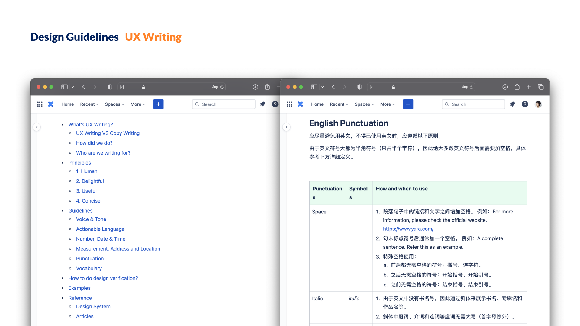
We have agronomist or other experts in the platforms, but most of our users are novice users. We should avoid using academic terms and use "actionable language" instead of "noun", such as "Scan the QR code" instead of "There's a QR code...". Basically, it means building your own UX Writing guideline in the beginning phase.

I did a complete UX Writing guideline to avoid inconsistency
One last thing worth to mention is that I was new to the farming business, just like most of our other team members. So before start, we did a detailed field research to understand the users' daily activities and the fertilizer business: I visited 4 provinces together with our product managers, met 3 distributors, 32 farmers, and 44 retailers.
The design team and me also did a lot of desktop research to know the farming business, that includes 6 market scans, 9 competitor analysis, 2 visual trends... By the end, we generated 13 user segments, 4 opportunity areas, 4 major pain points and 12 product ideas for future business expansion. It's a beneficial thing to do, you can jump out of pixels and get to know the bigger picture. Then you dive back to the pixels and you know what to change.

Farmers and retailers use Android mobiles mainly, no desktop. They even don't do paper accounting, their distributors are basically doing all the paper work for them

Till now, I hope you already got all my tips. Let's summarize again:
With those tips, even people are against digital, I believe that they will love the products you created. What else? I think that farming is actually interesting. If possible, designers should contribute our time and skills into all kind of business.